Table of Contents
- Introduction
- Why This Topic Matters
- Quick Answer
- Who This Guide Is For
- The 8 Design Principles
- Beginner Guide
- Advanced Tips
- Desktop Instructions
- Mobile Instructions
- Examples
- Common Mistakes
- Best Practices
- Pro Tips
- Creator Tips
- SEO Tips
- Marketing Tips
- Frequently Overlooked Facts
- Myths vs Facts
- Troubleshooting
- Summary
- Final Thoughts
- Call to Action
- FAQs
Not every thumbnail principle you've heard is worth following. Here are 8 design principles that genuinely move click-through rate, plus the common mistakes that quietly hurt it.
Introduction
Thumbnails are packaging, and packaging decides whether someone stops scrolling. But "make a better thumbnail" isn't advice — it's a wish. This guide breaks click-through rate down into 8 concrete, testable design principles you can actually apply to your next upload, along with the mistakes that quietly undo them.
Why This Topic Matters
Click-through rate is one of the clearest signals a creator can directly influence. Unlike watch time or subscriber growth, which depend on many downstream factors, CTR is largely decided by two things: the thumbnail and the title. Getting the thumbnail right is one of the highest-leverage things a creator can improve.
Quick Answer
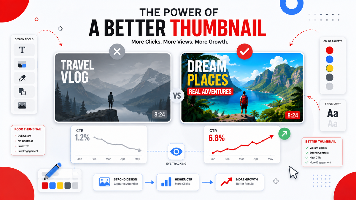
High-CTR thumbnails share a few consistent traits: strong contrast against the surrounding feed, a single clear focal point, legible text at small sizes, an expressive or curiosity-driving image, and visual consistency with the creator's overall channel branding.
Who This Guide Is For
- Creators trying to diagnose a low CTR
- Thumbnail designers looking for a repeatable framework
- Editors who make thumbnails but don't get much CTR feedback
- Agencies managing thumbnail strategy across multiple channels
The 8 Design Principles
1. High Contrast Against the Feed
YouTube's interface is mostly white, gray, and red. Thumbnails that lean into darker backgrounds or unusually saturated colors tend to stand out more in a feed dominated by neutral tones.
2. One Clear Focal Point
The eye needs somewhere to land immediately. Thumbnails packed with multiple competing elements — several faces, several text blocks, busy backgrounds — force the viewer to work to understand what the video is about, and most won't bother.
3. Legible at Small Sizes
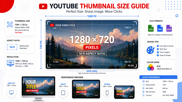
Most views happen on mobile, where a thumbnail might render at roughly the size of a postage stamp. Any text needs to be readable at that scale — which usually means large, bold, and limited to 3-5 words.
4. Genuine Facial Expression
When a face is part of the thumbnail, an exaggerated but authentic expression — shock, curiosity, excitement — tends to outperform a neutral or posed look, because it signals emotional stakes before the viewer even reads the title.
5. Curiosity Without Deception
The strongest thumbnails create a specific, answerable question in the viewer's mind ("what happened here?") without misleading them about what the video actually delivers. Curiosity gaps that don't pay off in the video hurt retention and long-term channel trust.
6. Consistent Branding
Recurring visual elements — a consistent color palette, font, or framing style — help returning viewers recognize your content instantly in a crowded feed, which compounds over time even if no single thumbnail is dramatically better than the last.
7. Title-Thumbnail Complementarity
The thumbnail and title should work together, not repeat each other. If the title already states the key fact, the thumbnail should add visual context or emotional stakes instead of restating the same words.
8. Test at Actual Feed Size
A thumbnail that looks great as a full-screen image can fall apart at the tiny size it's actually viewed at. Always preview it shrunk down to real feed dimensions before publishing — most editing software or a quick check with the Thumbix Thumbnail Downloader and resizer can help confirm how it holds up.
Beginner Guide
If you're just starting out, focus on principles 1-3 first: contrast, a single focal point, and legible text. These three alone fix the majority of low-CTR thumbnails.
Advanced Tips
- Run a genuine A/B test using YouTube Studio's thumbnail testing feature rather than guessing based on personal preference.
- Study your own channel's historical CTR data by thumbnail style to find patterns specific to your audience, since best practices are a starting point, not a guarantee.
- Build a small internal style guide (colors, fonts, framing rules) so every thumbnail on your channel reinforces the same visual identity.
Desktop Instructions
Most professional thumbnail design work happens on desktop using tools like Photoshop, Canva, or Affinity Photo, where you have full control over contrast, layering, and text placement.
Mobile Instructions
On mobile, apps like Canva or PicsArt let you make quick adjustments on the go, though for serious design work, desktop tools remain the more precise option.
Examples
- A tech reviewer switches from cluttered thumbnails with three text callouts to a single bold word plus a strong facial expression, and sees a meaningful CTR increase within a few uploads.
- A cooking channel adopts a consistent top-down food shot style with a matching color-graded border across every video, making their content instantly recognizable in a crowded feed.
- A gaming creator tests two thumbnail variants — one static screenshot, one custom illustrated version — and finds the illustrated version consistently outperforms in CTR testing.
Common Mistakes
- Overloading the thumbnail with text — more than about 5 words rarely reads clearly at feed size.
- Using low-contrast colors that blend into YouTube's white interface.
- Misleading curiosity gaps that hurt watch time and audience trust once the video doesn't deliver.
- Ignoring mobile preview size before publishing.
- Copying a competitor's exact style without adapting it to your own channel's branding.
Best Practices
- Design at full resolution, then always preview shrunk down before publishing.
- Keep a consistent visual identity across uploads so your channel becomes instantly recognizable.
- Pair thumbnail testing with title testing, since the two work together, not independently.
Pro Tips
- Study thumbnails from creators outside your niche entirely — cross-niche inspiration often produces more original results than only studying direct competitors.
- Keep a swipe file of high-performing thumbnails (downloaded with a tool like Thumbix) organized by the design principle they demonstrate, not just by channel.
Creator Tips
Don't chase every trend you see in your niche. The strongest channels tend to have a recognizable, consistent thumbnail style rather than constantly shifting to match whatever's currently popular.
SEO Tips
While thumbnails don't directly factor into text-based search ranking the way titles and descriptions do, a strong CTR feeds directly into how YouTube's algorithm evaluates and distributes a video, making thumbnail quality an indirect but significant discovery factor.
Marketing Tips
For brands and agencies, a documented thumbnail style guide — covering colors, fonts, and composition rules — keeps quality consistent even as different designers or freelancers rotate through a channel's content production.
Frequently Overlooked Facts
- CTR is measured relative to impressions, not views, so a thumbnail can technically have a strong CTR while the video still underperforms on watch time if the content doesn't match viewer expectations.
- YouTube Studio's built-in thumbnail testing feature lets creators run genuine A/B tests without any third-party tools.
- CTR benchmarks vary enormously by niche and channel size, so comparing your CTR to generic industry averages is often misleading.
Myths vs Facts
- More text on a thumbnail always communicates more: Excess text usually reduces readability and hurts CTR at small sizes
- The most extreme, clickbait-style thumbnail always wins: Deceptive thumbnails often hurt retention and long-term channel trust
- A single "perfect" thumbnail formula works for every niche: Best practices are a starting point; testing against your specific audience matters more
Troubleshooting
My CTR dropped after a redesign. Compare your new style against your historical best-performers using YouTube Studio's thumbnail data before reverting or adjusting further. My thumbnail looks great big but bad small. Always preview at actual feed size — issues with contrast and text legibility often only show up at that scale. My CTR is high but watch time is low. This usually points to a mismatch between what the thumbnail promises and what the video delivers.
Extended Walkthrough: Auditing Your Own Channel's Thumbnails
Applying these eight principles works best when you treat it as an audit rather than a one-time redesign. Start by pulling up your channel's last twenty to thirty videos in YouTube Studio and sorting by CTR. Look specifically at the thumbnails for your five highest-performing and five lowest-performing videos side by side, and try to identify which of the eight principles are present in the strong performers and missing from the weak ones. This kind of direct, self-referential comparison is almost always more useful than generic industry benchmarks, because it accounts for your specific audience's preferences and your niche's visual norms. Once you've identified a pattern — say, your strongest thumbnails consistently use a dark background with a single bold word, while your weakest ones are text-heavy and busy — you have a concrete, testable hypothesis for your next few uploads rather than a vague sense that you should "try harder" on thumbnails.
Case Study: A Small Channel's CTR Turnaround
Consider a mid-sized cooking channel that historically used cluttered thumbnails packed with three or four text callouts describing every step of a recipe. After auditing their top and bottom performers, they noticed their few genuinely high-CTR videos all shared a simple pattern: one finished dish, shot from a consistent overhead angle, with no more than two words of text. Over the following month, they standardized every new thumbnail around that exact formula. CTR on new uploads climbed noticeably compared to their channel average, and just as importantly, the visual consistency made their content instantly recognizable in a crowded recipe-heavy feed — an effect that compounds well beyond any single video's performance.
Balancing Consistency With Freshness
A common tension creators run into once they've settled on a working thumbnail formula is knowing when, if ever, to deviate from it. The general guidance here is to treat your core visual identity — color palette, font choice, general framing — as fixed, while allowing the specific content of each thumbnail (the exact expression, the specific object shown) to vary naturally from video to video. This gives you the recognition benefits of consistency without every thumbnail looking like a copy-paste template, which can start to feel stale to long-time subscribers even if it continues to perform reasonably well with new viewers.
Summary
High-performing YouTube thumbnails consistently apply a small set of principles: strong contrast, a single focal point, legible text, genuine expression, honest curiosity, consistent branding, title complementarity, and real-size testing. None of these guarantee success alone, but together they form a reliable framework.
Final Thoughts
Thumbnail design isn't about finding one perfect formula — it's about consistently applying principles that respect how and where your audience actually sees your content, then testing and refining from there.
Call to Action
Building a thumbnail swipe file for inspiration? Grab any reference thumbnail in full HD with the free Thumbix Thumbnail Downloader — no watermark, no sign-up.
Frequently Asked Questions
What makes a YouTube thumbnail get more clicks?
High contrast, a single clear focal point, legible text at small sizes, and genuine emotional expression are the strongest consistent drivers of click-through rate.
How much text should a YouTube thumbnail have?
Generally no more than 3-5 words, since anything more becomes difficult to read at the small size thumbnails render on mobile feeds.
Does thumbnail color affect click-through rate?
Yes — thumbnails with strong contrast against YouTube's mostly white and neutral interface tend to stand out more and attract clicks.
Is clickbait thumbnail design effective?
Misleading thumbnails can boost short-term CTR but often hurt watch time and audience trust once viewers feel the video didn't match what was promised.
How can I test which thumbnail performs better?
YouTube Studio includes a built-in thumbnail A/B testing feature that lets you compare multiple thumbnail variants directly on live traffic.
Should my thumbnail and title say the same thing?
No — they work best when they complement each other, with the thumbnail adding visual context or emotional stakes rather than repeating the title's words.
What's a good average CTR on YouTube?
CTR benchmarks vary widely by niche, channel size, and traffic source, so it's more useful to compare your own videos against each other than against a generic industry average.
Do faces improve thumbnail performance?
Often, yes — a genuine, expressive face tends to draw attention and communicate emotional stakes faster than text or a static object alone.
How often should I redesign my thumbnail style?
There's no fixed schedule — most successful channels evolve their style gradually while keeping consistent core branding elements, rather than overhauling everything at once.
Can a good thumbnail fix a video with weak content?
A strong thumbnail can improve CTR, but if the video doesn't deliver on what the thumbnail promises, it typically hurts retention and future recommendations.